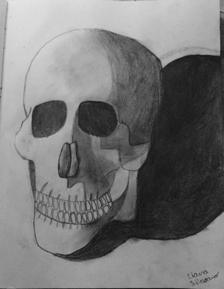
12.1.17

Oil Painting: Paint it "Black"

My goals and intentions for this piece was to paint the black object (the shoe) black without using black and to emphasize the shine reflecting off of the shoe and the pool ball. I have accomplished making black by mixing alizarin crimson and ultramarine blue together to make a dark purple that reads as black in the painting. I accomplished emphasizing reflectivity by looking at my picture and seeing where the light was reflecting of off the shoe and pool ball then adding white paint to those spots. What surprised me most about this experience was how messy the paint was and how fun and easy it was to mix different colors together. Since this was my first time using oil paint i did a lot of experimenting to see what colors together made what and it was very interesting. My painting is about colors in black and reflectivity.  The most difficult challenge I faced while painting this piece was trying to figure out what colors to mix to get a certain color that I needed (if that makes any sense). I met that challenge by mixing different colors until I got the color that was a close match to the color in my picture. I experienced artist thinking by being able to paint that black without using black and being able to recognize the other details and the colors of those details. My painting really works in the sense that the shoe reads as black even though it's not and you are really able to see the shadows and reflectivity. From this piece, I have learned how to mix different colors to create a certain color and I have also learned how to create better shadows and emphasize the reflectivity better. I really like how Annie was about to make her cup look shiny and realistic by adding a few white spots and the things that were reflecting from the cup in the picture she took. If I had a do-over, I would draw and paint the shoe to look better and more realistic. I feel best about the pool ball, the refections, and the shadows.

10.12.16

Reflectivity and Color on Makeup: An Oil Pastel Color Study

My goals and intentions for this artwork were to recreate the still-life by adding lots of light and color using oil pastels. I accomplished this by having a light shine down on the still-life and coloring in the colors I saw and the light and colors reflecting off of the mirrors. What surprised me the most about this experience was how I was able to recreate the colors and make them look how they were on the still-life. My drawing is about reflectivity, color, and realism. The most difficult challenge I had to face while working on this piece was making the correct colors that were reflecting off of the mirrors. I met that challenge by really looking at the still-life and recreating it the best I could. I experienced artist thinking while working on this piece by being able to see and emphasize color in the reflective objects. My drawing really works in the sense that it really emphasizes lots of color and the reflectivity from the mirrors. From this piece, I have learned how to emphasize color in reflective objects instead of seeing them as neutral colors. I really liked how Annie set her still-life on a colorful cloth to create lots of color reflecting off of her still-life. If I had a do-over, I would have probably made the top mirror a bit more round. I feel best about the lipstick in the piece.

2.12.16

Oil Pastel Spread: "Fruit and Jug on a Table" by Paul Cezanne

This is my two-page oil pastel spread. On the left side, I used watercolor for the background. Then, I drew a full size picture of the work I was recreating and then I picture of the part of the piece I blew up for the  oil pastel part. I also wrote facts about who Paul Cezanne was and why I chose him as my mentor. On the right side, I used oil pastels to recreate a section of his painting. I chose Paul Cezanne as my mentor for this spread because I was fascinated by the colorful bowls of fruit in the still-lives he painted and I really liked how he blended the colors together.

28.11.16

jpg. challenge 6: leftovers

In this challenge we had to interpret our idea of "leftovers" 


This is how my plate and cutlery were left over after I ate dinner. 


Leftovers in my fridge. 


Leftover books, that I used to read, on my book shelf. 


Some art that was leftover in my sketchbooks along with some pencils. 


My leftover cup when I was finished my coffee.


18.11.16

Light in the Darkness


For this project, we had to enlarge a picture that we took from one of our jpg. challenges. I chose this picture of a lamp in my living room that I took at night and then turned it into a charcoal painting. I chose this because it was very interesting in the sense that the light really pops out and is emphasized in the picture. My intentions for this piece was to make that light pop out as it did in the picture and to use different values of lights along with darks. I accomplished these things by making the lightest lights with white chalk, the darkest dark with compressed charcoal, and then the rest of the values in between with my eraser and charcoal sticks. My drawing is about value and contrast. My drawing really works in the sense that it is able to depict and emphasize the lights from the darks and the light really shines in the darkness. 

4.11.16

Carry Out Charcoal

For this project, we had to draw a carry-out box with chopsticks in charcoal. My goals and intentions for this piece was to make the chopsticks as if they were leading your eye into the picture and emphasize the different values of lights and darks (at least six). I also wanted to make the box look as three dimensional as possible. I accomplished making the box look three dimensional by sighting the lines with my charcoal pencil and drawing it in the same diagonals as I sighted it. I accomplished making the chopsticks lead you eye into the picture by placing the chopsticks in a certain way on my still-life. I accomplished emphasizing the different values by tracing out my lights and then deciding the lightest points from the darkest points. What surprised me most about my experience was how simple it was to figure out the different values of lights and darks. My drawing is about value and contrast. The most difficult challenge I had to face while doing this drawing was drawing the shapes of the folds and the chopsticks correctly. I faced this challenge by making them look the best I could make them and then make the lights and darks stand out. I experienced artist thinking while doing this project because I was able to trace out the light from the dark and make all of the correct proportions. My drawing really works in the sense of the contrasting between the lights and the darks and the realism of the three dimensional look of the box. Something that I have learned while doing this drawing was that sighting is a great technique and can really help figure out what something actually looks like in the sense of where the lines are and how it is shaped. I really like how Jessica really emphasized the lights and the darks in her piece. I also like how the chopsticks really lead you into the picture. If I had a do-over, I would draw the shapes of the folds a little better and position the chopsticks differently. I feel best about the values and the contrast.

26.10.16

Stop, Drop, and Draw Sketch Book Drawing

For this drawing, I chose to draw a skull. My goals and intentions for this piece was to draw what I saw and to make the exact shadows that I saw. I accomplished these goals by doing just that, drawing what I saw as and making it look as realistic as possible. What surprised me most about working on this drawing was how well it turned out and that I was able to finish it in two class periods. My drawing is about realism, shading, and shadows. The most difficult challenge I had to face was, honestly, drawing the teeth. I faced this challenge by drawing them how I thought they looked best and then just going with it. I experienced artist thinking by being able to see the difference between the light and the shadows. My drawing really works in the sense that you can tell where the light is hitting and it easily distincts where that light is along with where the shadows are. From this drawing, I have learned (and improved) on drawing from a still-life that was right in front of me. If I had a do-over, I would probably make the skull slightly rounder. I feel best about the shadows, shading, and the eyes.